Details

    • Type: Improvement
    • Status: Closed
    • Priority: Major
    • Resolution: Fixed
    • Affects Version/s: 4.0.0-b1
    • Fix Version/s: 4.0.0-b1
    • Component/s: Staff Interface
    • Labels:
      None

      Description

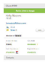
      1. Remove gradients from within the client profile contact box including the Member, toggle, and contact sections.

      2. Move the heading and status markup above and outside the client_detail_box_inner div so that the border does not extend into these sections.

      Requires updating the following style to 248px:

      .client_detail_box .heading {
      width: 248px;
      }

      3. Set the panel heading to use the same colors as other panels from the theme.

        Activity

        admin Paul Phillips created issue -
        admin Paul Phillips made changes -
        Field Original Value New Value
        Epic Link CORE-1841 [ 12716 ]
        admin Paul Phillips made changes -
        tyson Tyson Phillips (Inactive) made changes -
        Sprint 4.0.0 Sprint 2 [ 20 ]
        tyson Tyson Phillips (Inactive) made changes -
        Rank Ranked higher
        tyson Tyson Phillips (Inactive) made changes -
        Story Points 1
        cody Cody Phillips (Inactive) made changes -
        Fix Version/s 4.0.0 [ 10603 ]
        tyson Tyson Phillips (Inactive) made changes -
        Status Open [ 1 ] Resolved [ 5 ]
        Resolution Fixed [ 1 ]
        Hide
        tyson Tyson Phillips (Inactive) added a comment -

        #3 is not done for this. I think you should revise the Contacts section that appears in this box as well before moving this to the theme colors.

        Show
        tyson Tyson Phillips (Inactive) added a comment - #3 is not done for this. I think you should revise the Contacts section that appears in this box as well before moving this to the theme colors.
        Hide
        admin Paul Phillips added a comment -

        You're right. This color should be #eaeaea for both the heading and the contacts heading, and any other heading that may appear in this area. This will make it consistent in color with both the calendar and the setting headings.

        Show
        admin Paul Phillips added a comment - You're right. This color should be #eaeaea for both the heading and the contacts heading, and any other heading that may appear in this area. This will make it consistent in color with both the calendar and the setting headings.
        admin Paul Phillips made changes -
        Hide
        admin Paul Phillips added a comment -

        #eaeaea for section headings

        Show
        admin Paul Phillips added a comment - #eaeaea for section headings
        tyson Tyson Phillips (Inactive) made changes -
        Status In Review [ 5 ] Closed [ 6 ]

          People

          • Assignee:
            tyson Tyson Phillips (Inactive)
            Reporter:
            admin Paul Phillips
          • Votes:
            0 Vote for this issue
            Watchers:
            2 Start watching this issue

            Dates

            • Created:
              Updated:
              Resolved:
              Fix Release Date:
              15/Sep/16

              Agile