Details
-
Type:
 Bug
Bug
-
Status: Closed
-
Priority:
 Minor
Minor
-
Resolution: Fixed
-
Affects Version/s: 4.5.0
-
Fix Version/s: 4.6.0-b2
-
Component/s: Plugins, Staff Interface
-
Labels:None
Description
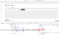
When creating a package group as an admin, there is a white gap in the far right side of the markdown editor.
Removing the width from the following style seems to correct it:
.tab_content .inner_content textarea
{ width: 99%; height: 150px; }.tab_content .inner_content textarea
{ height: 150px; }If there's no side affect to removing this, it looks better with the gray background fitting the entire width.
Activity
| Field | Original Value | New Value |
|---|---|---|
| Fix Version/s | 4.6.0-b2 [ 11121 ] | |
| Fix Version/s | Short Term [ 10800 ] |
| Priority | Major [ 3 ] | Minor [ 4 ] |
| Rank | Ranked higher |
| Sprint | 4.7.0 Sprint 1 [ 76 ] |
| Rank | Ranked lower |
| Sprint | 4.7.0 Sprint 1 [ 76 ] | 4.6.0 beta Sprint 1 [ 86 ] |
| Rank | Ranked lower |
 Automated transition triggered when Jonathan Reissmueller created a branch in Stash -
| Status | Open [ 1 ] | In Progress [ 3 ] |
| Summary | Support Manager: Markdown editor style issue | Markdown editor style issue |
| Description |
When replying to a ticket as an admin, there is a white gap in the far right side of the markdown editor.
Removing the width from the following style seems to correct it: .tab_content .inner_content textarea { width: 99%; height: 150px; } .tab_content .inner_content textarea { height: 150px; } If there's no side affect to removing this, it looks better with the gray background fitting the entire width. |
When creating a package group as an admin, there is a white gap in the far right side of the markdown editor.
Removing the width from the following style seems to correct it: .tab_content .inner_content textarea { width: 99%; height: 150px; } .tab_content .inner_content textarea { height: 150px; } If there's no side affect to removing this, it looks better with the gray background fitting the entire width. |
| Remaining Estimate | 0 minutes [ 0 ] | |
| Time Spent | 17 minutes [ 1020 ] | |
| Worklog Id | 12286 [ 12286 ] |
 Automated transition triggered when Jonathan Reissmueller created pull request #676 in Stash -
| Status | In Progress [ 3 ] | In Review [ 5 ] |
| Resolution | Fixed [ 1 ] |
 Automated transition triggered when Tyson Phillips (Inactive) merged pull request #676 in Stash -
| Status | In Review [ 5 ] | Closed [ 6 ] |

