Details
-
Type:
 Improvement
-
Status: Closed
-
Priority:
 Trivial
-
Resolution: Fixed
-
Affects Version/s: 4.0.0-b1
-
Fix Version/s: 4.0.0-b1
-
Component/s: Staff Interface
-
Labels:None
-
Epic Link:
Description
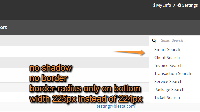
Update the styles for the drop down menu for the search box
Change the width from 224px to 225px:
header#main_header .select_box ul#all_search_options
{ width: 225px; }Update .dropdown-menu to remove box-shadow, border, and border-radius, and then add a border radius on the bottom of the menu only:
-webkit-border-bottom-right-radius: 4px;
-webkit-border-bottom-left-radius: 4px;
-moz-border-radius-bottomright: 4px;
-moz-border-radius-bottomleft: 4px;
border-bottom-right-radius: 4px;
border-bottom-left-radius: 4px;
Also the font looks darker than everywhere else in the dropdown menu. If it's not using the standard theme font color, it probably should be.
Activity
| Field | Original Value | New Value |
|---|---|---|
| Attachment | capture-for-jira-screenshot-20160331-103200-153.png [ 11518 ] |
| Rank | Ranked higher |
| Description |
Update the styles for the drop down menu for the search box Change the width from 224px to 225px: header#main_header .select_box ul#all_search_options { width: 225px; } Update .dropdown-menu to remove box-shadow, border, and border-radius, and then add a border radius on the bottom of the menu only: -webkit-border-bottom-right-radius: 4px; -webkit-border-bottom-left-radius: 4px; -moz-border-radius-bottomright: 4px; -moz-border-radius-bottomleft: 4px; border-bottom-right-radius: 4px; border-bottom-left-radius: 4px; *Also* the font looks darker than everywhere else in the dropdown menu. If it's not using the theme font color, it probably should be. |
Update the styles for the drop down menu for the search box
Change the width from 224px to 225px: header#main_header .select_box ul#all_search_options { width: 225px; } Update .dropdown-menu to remove box-shadow, border, and border-radius, and then add a border radius on the bottom of the menu only: -webkit-border-bottom-right-radius: 4px; -webkit-border-bottom-left-radius: 4px; -moz-border-radius-bottomright: 4px; -moz-border-radius-bottomleft: 4px; border-bottom-right-radius: 4px; border-bottom-left-radius: 4px; *Also* the font looks darker than everywhere else in the dropdown menu. If it's not using the standard theme font color, it probably should be. |
| Epic Link | CORE-1841 [ 12716 ] |
 Automated transition triggered when Tyson Phillips (Inactive) created a branch in Stash -
| Status | Open [ 1 ] | In Progress [ 3 ] |
 Automated transition triggered when Tyson Phillips (Inactive) created pull request #124 in Stash -
| Status | In Progress [ 3 ] | In Review [ 5 ] |
| Resolution | Fixed [ 1 ] |
 Automated transition triggered when Cody Phillips (Inactive) merged pull request #124 in Stash -
| Status | In Review [ 5 ] | Closed [ 6 ] |

What about the company drop-down menu? It's very similar to the search menu.